Christmas Melancholia 2013


1. Snow White in Appalachia / David Sylvian
2. Just a Blip / Arthur Russell
3. Cry the Clock Said / Gary Numan
4. An Avalanche of Stars / Devastations
5. Deep Skanner / La Bambola Del Dr Caligari
6. Requiem for the Static King Part 2 / A Winged Victory For The Sullen
7. Viimeinen Monni (The Last Catfish) / Ø
8. Tonight Was a Disaster / Casiotone for the Painfully Alone
9. Silver Rings / Majical Cloudz
10. Wheels / Dirty Three
11. Now You're Taken / Mogwai
12. Westward Bound / Mark Hollis

Read more...


Read more...

Here's a short interview I recently did with Andrei Kaigorodov about my project The Sartorialtwist


Who is Harry Woodrow?
I am an artist and creative director from London

Where did this idea come from? 
Mostly because I wanted to inject some much needed chaos into streetstyle blogs, which were something that had originally been fascinating windows into local styles and subcultures, but I felt had unwittingly succeeded in killing those things that they were celebrating. I say this as I think that in a lot of ways the internet with its instant and incessant recording and broadcasting has created a virtual global homogeny in 'streetstyle' — go to any city in the (developed) world and you get exactly the same tribes as you do in any other city in the world, there's much less local incubation of ideas and an true underground has become impossible. Saying all that, I'm sure this will change as we humans learn to deal with this new world we've created, and it will get interesting again in ways that I can't even imagine.

What's the response to the project? 

It's been really good, and very broad in its audience, I've had appreciation from all kinds of people — 14 year old fashion bloggers in Taipei, gender theorists in New York, the international design and fashion press, and lots of people who just find it very entertaining. 

You also invite "rightful owner of images" to get in touch with you.  Did he (I mean Scott)? 
Not yet... I've emailed him a couple of times, but no response. From this I can only assume that he's being quietly tolerant, which is good as I initially worried I'd get a cease and desist letter pretty quickly. If I ever saw him on the street I'd go and have a chat for sure.


Read more...


Read more...

Bred to be Boring again

This morning I was thinking about my earlier article Bred to be Boring, and realised that the important word I'd failed to use was expression. Maybe our current period's prevailing style of graphic design so enthralled by content to be devoid of personality could be described as post-expressionism?

Read more...

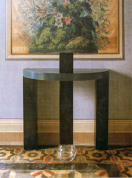
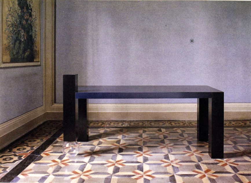
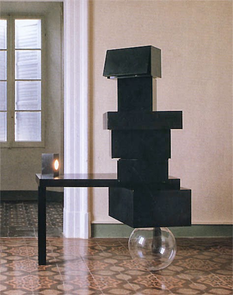
Meta Memphis

As everyone's been banging on about Ettore Sottsass and Memphis, I thought I should show some long-neglected furniture pieces that my dad Bill Woodrow — plus other artists including Franz West, Alighiero Boetti, Sol Lewitt, Mimmo Paladino and Lawrence Weiner — created for the Memphis company in 1991, the Meta Memphis Collezione 1991.

In the catalogue's introduction, Marco De Michelis describes the artists' temporary role as designers:
"[they] seem to deal with this topic by following two basic lines of thought: on the one hand, a return to memory and tradition looking for the archetypal figures of home life and, on the other hand, a conceptual handling of objects by using unusual materials and functional combinations. An attribute of this is that such attitudes are perfectly interchangeable and complementary".

Bill Woodrow — Ellen I, 1991

Bill Woodrow — Ellen I, 1991
Bill Woodrow — Harry, 1991

Bill Woodrow — Ellen III, 1991


Bill Woodrow — Ellen II, 1991
Bill Woodrow — Pauline, 1991

Read more...


Read more...

Bred to be Boring

As I touched upon in the last issue, deep in the recesses of time, before likes, reblogs and pins, you could only really see contemporary graphic design in its natural context — record sleeves in record shops, posters on walls etc — or in the two or three compendium books that were put together each year. 

Back when I was studying at Central Saint Martins in the mid 1990s the compendium making the most noise was Typography Now by Rick Poynor, and naturally — as it showcased the work of the previous generation to my own — I hated it. It was full of designers and studios making what I thought of as extremely self-indulgent, narcissistic and just really fucking ugly work. They seemed to be obsessed with showing the viewer that they and only they had created their creations, it was entirely about their own egos, with scant regard for communication, the client or appropriateness — whatever the project or brief, the result would look more or less the same. To my eyes this seemed like a terribly boring and complacent way to work: to tackle a project by making a slight variation to your last project, and the four or five projects before that, and just changing the words to say whatever your current client wanted them to say. 

At the time this reliance on formula (no matter how un-formulaic the designers thought they were being) looked like absolute anathema to the creative process, the opposite to how I wanted to work. From then on we at Multistorey, the studio I co-founded, actively fought against repetition or any sense of a ‘house style’ in our own work.* 

Many years have passed since then, but as I was sneerily flicking through a copy of it at a friend’s studio the other day, I worried myself by the realisation that I’ve become almost nostalgic for that Typography Now era of design egomaniacs. As I survey the world of graphic design all around me, I can’t help noticing that over the last few years, it has grown steadily less and less fashionable to have a personality as a designer. Of course this is no news at the commercial end of the scale, but what really disturbs me is how apparent it has become with the (for want of a better word) ‘intellectual’ design studios. Oh, sorry — I mean practices. 

There’s no distinction between anything, I find it impossible to tell where one person’s work ends and another’s begins. The desire to stand out, to add any iota of personality to the now so sacrosanct content has been eradicated. Often when I’m sent a link to a prospective employee’s personal website, I honestly don’t know whether I’m looking at a Tumblr of ‘inspiration images’ or their folio site. It’s a sea of clumsily pared down and timid work, conforming to one or another of a small handful of accepted layouts, my particular bugbear being the art gallery pamphlet with a few images randomly placed on the cover, with one word the right way up at the top, the second word rotated 90° at the right hand edge, the third word upside down at the bottom and the fourth word rotated -90° at the left edge. All set in Aperçu or a font with a weird lower case g designed by an ECAL student. Sometimes if I have further knowledge of the work, the designer will claim weeks of heavy research behind it, but I’m not so sure it takes reading countless Hans-Ulrich Obrist tracts to come up with that one. 

The reasons for this shift towards quiet conformity are many but intertwined. We mustn’t ignore the natural urge to destroy what came before you, as I felt about the generation before mine, but to destroy it with boredom? I think it’s more insidious than that. Firstly we have a relatively modern malaise — the paralyzing effects of super abundance, which I wrote about last time — there's just too much out there to look at. Whereas in pre-internet days you just naïvely got on with your own work and ideas, as you had no clue to what anyone else was doing, these days you can’t help knowing what current graphic design is supposed to look like, and to either consciously or subconsciously gauge your own ideas and aesthetics against it as either right or wrong. When you add in the factor of young designers (especially in the UK) growing up in an era of constant educational testing from a very early age, the craving for rules and the validation of being told you’re doing something correctly — that you’ve passed —becomes much more understandable.

That became very apparent when teaching the first year on the at CSM in the mid 2000s. Each incoming year, as a whole, was more docile than the previous. The students were constantly asking me exactly what I wanted them to do (to which I'd invariably answer "I want you to surprise me"), whether what they were doing was correct, and what mark I was going to give them. Whereas back when I was studying there the majority of us didn't give a shit what mark we got, as long as we were challenging ourselves and having fun. Rebellion has been slowly bred out of art schools. Especially now they're not called art schools anymore, they're just universities — sorry, ‘Uni’, (my god I hate that word) — like everyone else you were at 6th form with goes to, with the results-driven structures and checking systems that come with that territory. Actually, these days CSM isn’t even a university, it’s a correspondence course. Students come in on Monday morning, get briefed, go home and work in isolation on their laptops (with the internet to guide them). When it comes time to reenter the school for a group crit nobody speaks because nobody knows each other. The complete absence of studio space has killed that potent and driving mixture of gang-like camaraderie and competition that comes with close sustained proximity to your peers, the need to push yourself and each other further with the constant oneupmanship of experimentation, and I’m not convinced that this atmosphere can be recreated or replaced online.

Please believe me, I really don’t want to see a return to those days of Typography Now, but a bit of personality coming through in the work and a casting off of the fear of failure would be very refreshing, however scary that may be in our perpetually public era.

*For a couple of years we believed we were successful in this pursuit, but when friends started describing certain of our projects as being very ‘Multistorey’, it became clear that although there wasn’t quite a house style, we couldn’t deny a distinct way of thinking that manifested itself in the finished product. 

—————


This article first appeared in issue no.2 of Can't Understand New Technology, a print only publication created and edited by the very talented Camilla Grey and Steve Price.

Read more...

Read more...

Read more...

Be your own guide

A sad day indeed. RIP Jason — you helped me through some bad times, I wish I could have helped you through yours.

Read more...

Avenue Montaigne, Paris 8ème — Bank of Iran window

Read more...

My 'Rethink' piece for Icon issue 118


Read more...


Ghosts.. of the Civil Dead — John Hillcoat (1988)

Read more...

I've been playing with my iPhone and a pair of binoculars.


Read more...

The Systematic Eradication of Surprise and its Detrimental Effect on the Level of Joy and Wonder in the World


The presentations I’ve enjoyed the most in my life have usually taken this form: we open by verbally explaining our thought process for the particular project, without going into too many specifics, as the table is still empty. Maybe if there was a funny or defining moment involved that story will be recounted. During that preamble the sense of nervous anticipation is tangible, and when it ends, our (usually single) idea is unveiled. The client looks horrified. This really was not what they were expecting to see. They try to remain positive but I can sense their panic. 

This situation would have been easily avoided if only we’d have made a few moodboards at the very beginning. We could have trawled through It’s Nice That, pulled off loads of images of foil blocking on Colorplan, maybe some monograms, one which has been made into a repeat pattern and used on the lining of a gift box. Or if we were feeling a bit edgy maybe I’d hit Many Stuff and nick an image of a risographed self-published book about nothing, printed in pale pink and electric blue. It wouldn’t take that long. By showing without any context other people’s solutions for other other people’s briefs we could have set the scene, we could have all agreed on the visual style that we would be using. We wouldn’t even need to think of much of an idea. It would be amazing. Our client would feel comfortable at every part of the process — fuck it, they’d be an integral part of every step of the process. They’d feel real emotional ownership from the word go, and they’d be comfortably content with our complacently competent solutions come the final presentation. And I’d be so fucking bored I’d want to slash my fucking wrists.

I suppose this rant could be seen as the expected curmudgeonly old wanker stuff about how things were better before, but I really do believe that the superabundance of instantly accessed visual culture is creating a strange global homogeny. As it was so much harder to see what your contemporaries were doing in pre- and early internet times, you just got on with it, plunging blindly forward with your own ideas without being able to check whether or not what you were doing looked like what graphic design was supposed to look like right now. But there’s more to it than that, and it’s self-perpetuating. The rise of the brand agency with their strategists and their client pandering and hand-holding has slowly eradicated experimentation, risk and surprise, to the detriment of actual enjoyment by the people doing the work — and it shows in the timidity of the vast majority of work these agencies are producing. Where is the pleasure and challenge (fun) in giving the client something they’ve seen before and showing them what they’re going to get before they get it?

This, when coupled with the new moodboard culture — where everyone is now an online ‘curator’ and revelling in a smug illusion of creativity — has had the reverse of the desired effect. Design is no longer a verb, it’s a noun, a thing to be into, a culture in the contemporary sense of the word, meaning there’s loads of useless twee shit you can buy to tell other people that you’re into it. Witness the platoons of identically Folk clad folk filing through Pick Me Up with their printed cloth tote bags hanging flaccidly under their arms like ball-less scrotums.

An hour or so has passed, and the formerly horrified client is grinning and excited, giddy even. The presentation really was not what they were expecting to see, but after letting it sink in and seeing how it all works, they have realised that it was exactly what they needed. Everyone is happy.

A footnote:
The most horrifying manifestation of this fear of surprise that I’ve witnessed came when I was lucky enough to be working freelance in the early stages of a large car marque’s rebranding. The creative director had an intern print out seemingly every car badge in the world and stick them on the walls of the “studio” in groups: Animals, monograms, abstract symbols, crests etc. The task was to create a different route to sit comfortably in each of these categories. To which I countered “why don’t we do just one route that isn’t in any of these categories?”. I didn’t last very long.


This article first appeared in the debut issue of Can't Understand New Technology, a print only publication created and edited by the very talented Camilla Grey and Steve Price.

Read more...


Read more...